LOOPA
A Smarter Way to Learn: Topics You Want, Notes You Need
.png)
Designing a Podcast Experience Built for Learning — Not Noise
Most platforms prioritize entertainment over education.
People looking to grow their skills struggle to find:
- Trusted, verified creators
- Episodes focused on niche, in-demand topics
- Tools that help them remember what they learn
- Supportive community of like-minded individuals.
Loopa was created to make learning through audio interactive, premium, and community-driven.
Solutions That Empower Ambitious Learners
Loopa focuses on the three pillars missing from traditional podcast apps:
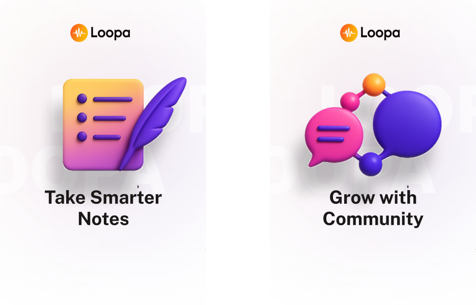
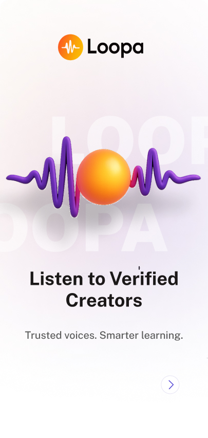
Verified Creators
Curated experts in AI, UX/UI, tech, and personal growth — so users know the content is credible.
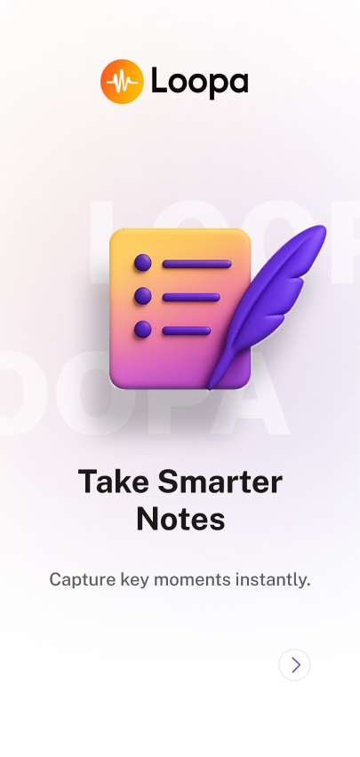
AI-Powered Note Syncing
Smart note-taking that summarizes key moments, syncs timestamps, and organizes learnings by topic.
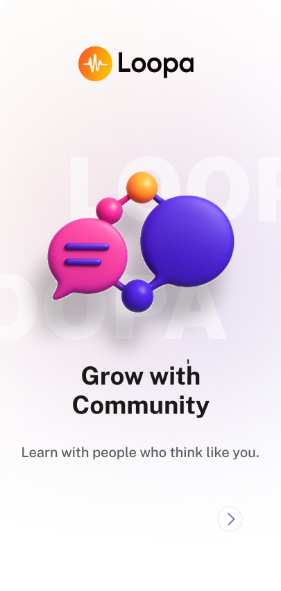
Community Messaging
A simple space to connect, share insights, and build networks with people learning the same skills.
.png)
Refining the Vision Through Research + Strategy
Research Activities
To define learner needs, I combined competitive research across Spotify, Apple Music, and Audible with interviews, surveys, personas, and journey maps.
Key Insights
- Podcast apps focus on entertainment, not learning. Competitors like Spotify and Apple Music don’t support note-taking, summaries, or structured learning.
- Listeners want a more intentional experience. Personas showed users crave tools that help them retain insights, stay organized, and track personal growth.
- Users need a simple way to turn listening into action. They want clear guidance, easy note capture, and a space to revisit what they’ve learned.
%20(1).png)
Concept Evolution (Podly → Loopa)
Podly started as a simple note-taking app for podcasts. Through research, the concept evolved into:
- A niche educational platform
- Verified creators to ensure trust
- AI note-taking as the main differentiator
- A more premium visual identity and flow
Challenges
- Designing a note-taking interface that felt new
- UI originally looked too generic → redesigned with refined gradients
- Community feature unclear in early versions
- Users wanted trusted experts, not random feeds
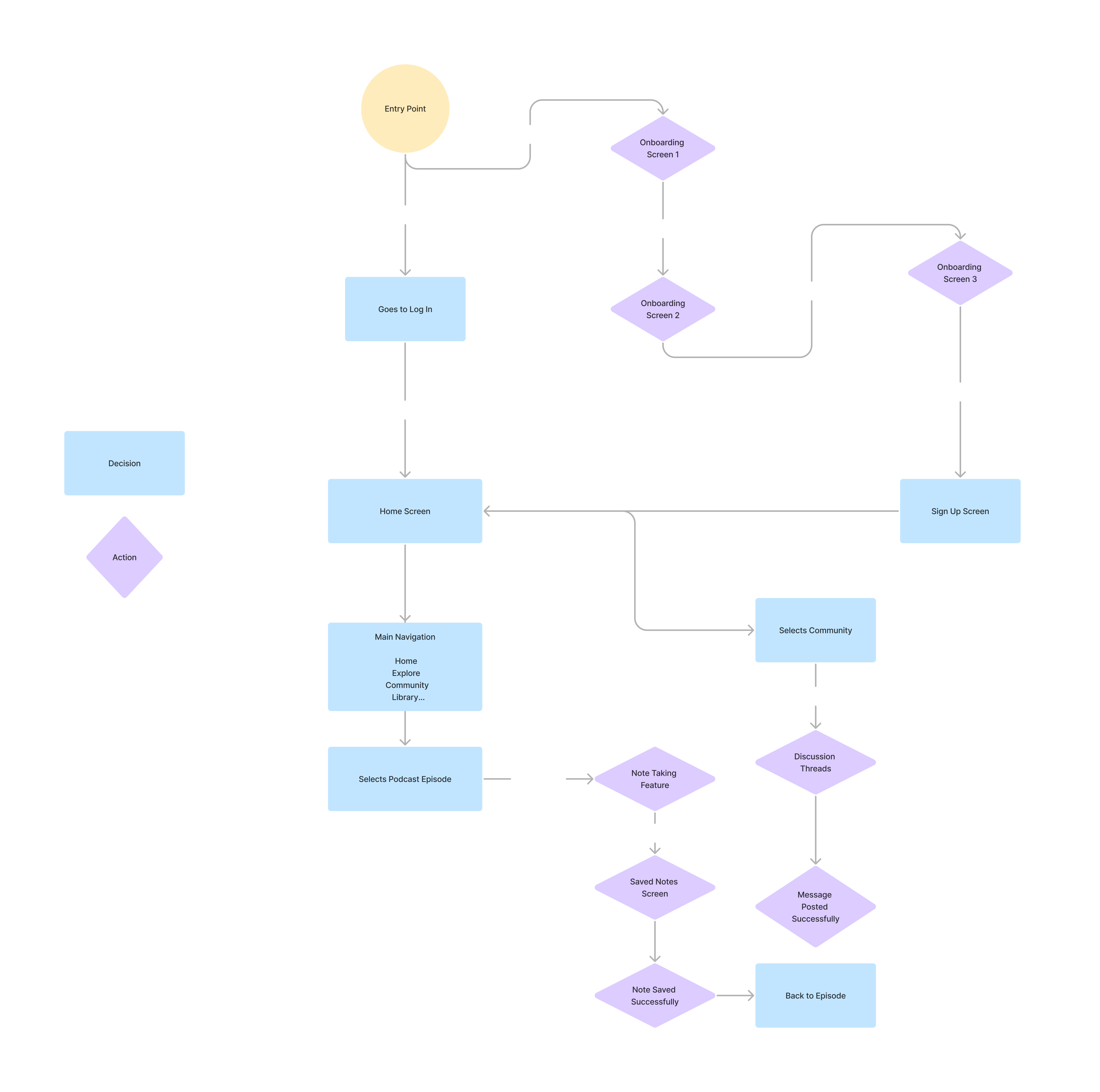
Mapping a Simple Learning Journey
.jpg)
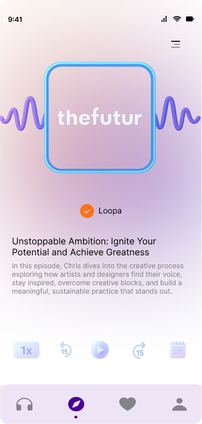
Bringing Loopa to Life
Each screen was designed to feel premium, modern, and education-focused:
- Floating 3D assets
- Rich gradients
- Strong content hierarchy
- Clear learning-first UI decisions
- Glassmorphism nav bar
Highlighted screens:
- AI Note Player
- Verified Creator Profile
- Community Chat
- Recommended Learning Feed
- Onboarding flow
.png)
Outcomes + Next Steps
Outcomes
- Transformed a broad idea into a niche learning product
- Created a premium aesthetic with strong UI improvements
- Designed interactive elements that support learning, not distract
Next Steps
- Add learning tracks
- Group discussions
- Desktop experience
- Creator analytics tools
